WebCreator 8 - Elements Overview
General
Where to find the elements
The available elements in WebCreator are in the Elements Bar, to the left of the Editing Area, as well in the Page/Elements menu:
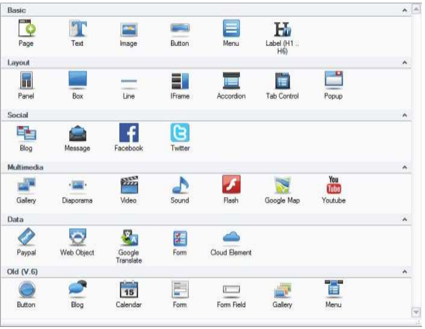
Element insertion
The insertion of an element on the current page is made by clicking on the element (and not Drag). The element is then placed in the middle of the page, except for certain elements, like images, that open a file selector.
Common properties
All elements have the following characteristics:
- A frame to select when the mouse pointer turns into a cross.
- Handles to resize.
- Properties, accessible in the Properties Area and organized in tabs.
- Elements concerns the name, the location and the appearance
- Option is used to apply appearing effects when the element is loaded
- Action and RollOver allows reactions from actions provided by the mouse on the element
- Link allows to create a link towards various destinations (file, pages, site, etc…)
- Position manages the size, the position, the padding, the margins and the positioning mode of the element
- Properties is a summary table of the properties
Alignment
The Format menu provides various tools for alignment of the elements. These tools are designed to facilitate alignment in free mode. It should not be used to block or containers in the automatic alignment mode

The first two tools (section Center in Parent) is used to position one or many elements inside of their container.
The following tools always applies to multiple elements and allows them to be positioned and resized relatively to each other.
To select multiple elements, successively click while holding the <Ctrl> key.
The reference element used for the alignment is the first one selected. It possesses handles of dark colors while the others have light colored handles.
Don't be afraid to experiment, you can always undo the changes with <Ctrl+Z>.
Stacking with the Z order
The Z-Order tool manages the superposition of the elements relative to each other. Think of it like a pizza : the page is the dough, the main container is the sauce and then we can put the ingredients in the order we like.
In the template V7 Style 1a for example, the image of the counter is in the background of the text.
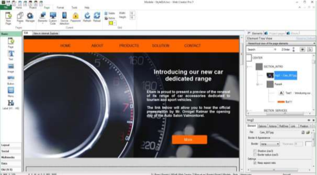
Select the image by clicking on the left side of the image.
In the Tree View, the image is selected and it is at the top of the tree Section_Intro panel. Items are displayed from top to bottom according to their order of creation in the container, from the background to the foreground .
At the top of the Tree View, click the down arrow to the right of the Z-Order option. The image then goes down the tree Section_Intro panel. Simultaneously, in the editing area, the image comes to the foreground, hiding the text and button.
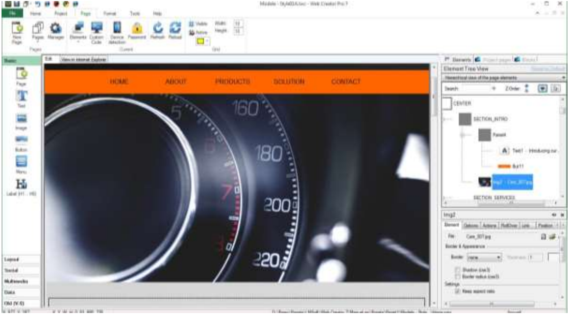
The Z-Order of the Tree View is precise and allows to move elements level by level . To move elements outside their parent panel, you need to cut and paste them to another container. This can be done also with drag & drop. Usually, the target container will become highlighted to help you position it where you want. It is a good idea to double check in the tree list to make sure everything is at its place.
Embedded mode
This mode, enabled by default, allows you to automatically place an item in a container by dragging it. A green frame surrounds the destination container when you hover over it.
When the embedded mode is disabled , the items are not included in containers, but are just deposited and remain independent of the container over which they are.
Add an element to a container
There are multiple ways to add an element to a container :
- After selecting the item, right-click and from the context menu, choose Cut (or Ctrl + x). Then select the destination container and right click / Paste (Ctrl + v) . This is the most convenient and most foolproof method.
- While the embedded mode is active, you can drag an item and let go above the container which is surrounded by a green frame. This method is simple but reserved for small movements in the Editing Area.
- Select the item, then right click / Add to container or Home / Select the item, then right click / Add to container or Home /Add to container and select the destination container . This method requires you to have named your containers to make them recognizable. and select the destination container . This method requires you to have named your containers to make them recognizable.
Group management
You will find a Group section in the Home menu, but it is only here to ensure the compatibility with older files from older projects generated by previous versions of WebCreator. Destined to be removed, it has been replaced with blocks management, who is more evolved and must be used onwards.
Principal elements presentation
We will now describe some of the key elements that you will need or for which explanations are deemed necessary. We will not speak of the elements that can be discovered easily by experimenting with their settings.
As indicated previously, the elements are directly available from the Elements Bar to the left of the interface. Thus the notation "element Base/Image" refers to the Base section in the Elements Bar and the Image element in it. The term properties of elements refers to the Properties Area, located at bottom right of the interface.
Image
When you click the element Base/Image, a dialog box opens and allows you to select an image in the WebCreator library or from your personal folders.
WebCreator will handle image resizing to avoid burdening the site unnecessarily.
Button
A new type of button is included since the version 7.
The transparency of the button can be set in the Button colors zone. The new buttons always come with fixed proportions and size. In the Element tab of the Properties Area, you can modify the size of the button from Small to Very Large, or choose custom to change freely the size and proportions of the button.
You can then add a custom border with custom thickness, color and transparency.
You can then give the button a monochrome icon or an image.
The ancient types of buttons are still available in the Old (V.6) section in the Elements Bar.
Menu
The menu has also been updated in version 7. To customize a Menu, you must go in its properties, Elements tab and then click on Configure elements.
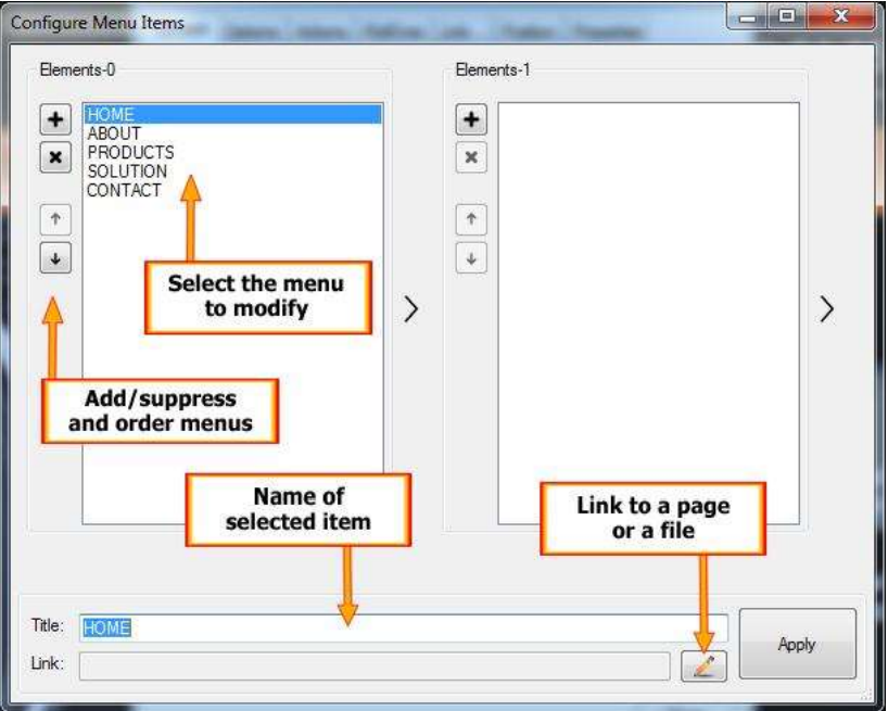
It is also possible to take the characteristics of a previously created menu in the project, with the Instance list. You can have multiple reusable menu patterns in different pages of the current project.
The Configure style button allows you to fully customize the appearance, color, font, alignment and other settings in the main menu and menu commands.
A very interesting option is to fix the position of your menu when scrolling the page so that it is always visible. To do this , place your menu in a panel and in the Component tab of the Properties panel , select the anchor box. Note that it works with all the panels, but it is especially useful with those containing a menu or information banner you want to display continuously.
Titles H1 H6
Title tags are not used for the formatting of the text (which is done with the text option ) but rather to make information available to search and referencing engines. Logically, the search engines give more importance to the H1 tags as H2, the H2 more than H3, and so on. So you need to include important texts and well chosen keywords. That said, you can add a Hx tag anywhere in the text. It's very interesting to have a clean page layout without a multitude of headlines.
Panels and Boxes
These are the major container you will use to structure your pages. You logically find them in the Layout section of the Elements Bar.
The difference between these two types of container lies in the configuration options and visual parameters. In summary: a box is much more graphic than a panel.
A Box can have different shapes, rounded corners, drop shadow, display an image, gradients, have a header and a footer, etc.
A Panel can be filled with one color, have a gradient of two colors or have a background image. Its main function is to delimit zones in a page i.e. sections into which blocks and elements will be placed.
A Panel can also automatically adjust to the height of its elements and to the width of the page, with the options Automatic Height and Full Width in the Position tab of its properties. On the LMSOFT website, the slideshow of the first page is placed in a panel with the option Full width . Thus, whatever the size of your display area, the slideshow adapts and takes the entire width of the page.
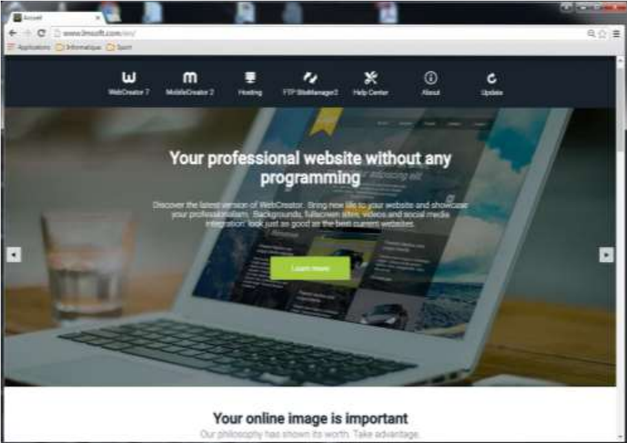
Finally, a Panel can be anchored , that is to say, when browsing , it can stay fixed on the screen when the user scrolls the page. This is achieved by checking the Anchor checkbox of the Elements tab in the properties.
Iframe : insert another site in a page
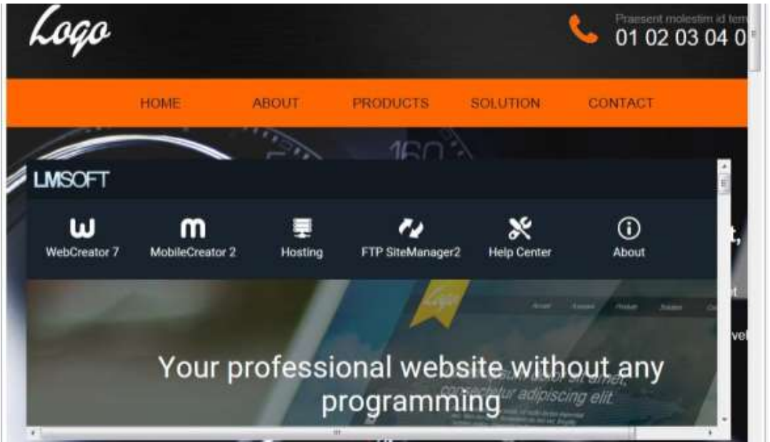
This element is for displaying an existing web page within a defined area of the current page. In the example below, the LMSOFT site appears in an iframe in the middle of the template V7 Style 1a. It does not make sense here but it's just to help understand.
Tab Control
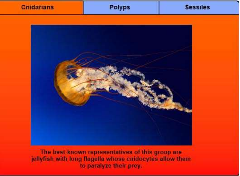
Here elements are displayed in panels that have a visible tab. The elements have to be placed in a special container named Canvas.
Accordion
The Accordion is a very similar element to the Tab Control, but the display is changed with a vertical sliding movement rather than with horizontal tabs.
The information is also contained inside the same special panels called Canvas.
Canvas
Each Canvas is actually a Container. You associate it with a title and display a page or a block following its size and number of elements you insert in it.
To define the name and the characteristics of each Canvas, you need to go in the Properties Area, Elements tab and select the Canvas you want to modify.
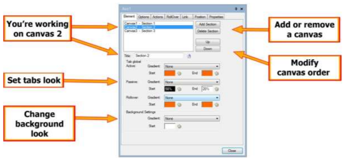
Please note that you need to select a Canvas to be able to insert elements or blocks in it.
Tip: note the exact dimension of the Canvas in the Position tab. You can then create blocks of the same size that will fit the Canvas.
Slide Show
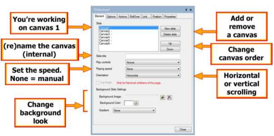
Generally with a Slideshow, the images are displayed one after the other, manually or automatically with a delay. In WebCreator , you can display any kind of additional elements , such as text , blocks that you have created, multimedia items, buttons, etc. Any kind of element actually. A good ideas is to use panels and blocks to combine the elements. The text over the images in LMSOFT’s site was included with this technique.
Like an accordion, each view in the Diaporama is a Canvas that you select, add and delete in the Properties Area, Element tab.
Web Elements
Restricted to advanced users/programmers, this element allows you to insert HTML code, javascript in your pages. The code is included as tags <div>.
Another method to add external code is found in Page/Add custom code. In this case, the code is added in the <body> section of the page.
Web Services
Web services are new and special elements which reside not in the project, but on LMSOFT servers. As these objects are managed as web services, you can access them from any device that has a browser: computer, tablet or phone. It is now possible to add a photo to a gallery, post a blog post or an article without having to open WebCreator.
WebCreator 8 has 3 Web Services: Blog, Photo Gallery and Article.
Access to Web Services
This is how to create, access and manage authorizations for LMSOFT’s Web Services.
First create an account with a valid email address and a password : http://webservices.lmsoft.com/login
With the standard WebCreator licence, you can create up to 5 accounts so that different people have access to Web Services and can edit the elements you assign to them. You can manage who has access to what editable elements.
If you need more accounts, such as a club with many members or if you make sites for others, you can upgrade to WebCreator Developer version. There are no limits on the number of accounts that you can create with the Developer version.
We will use the Article element to show how to work with these new cloud based elements.
Article cloud element
The first time you create an element Web Service ( Blog , Gallery or Article ), you need to access your Web service by entering a password.
Warning: choose a special password for accessing Web services, do not use your registration mail.
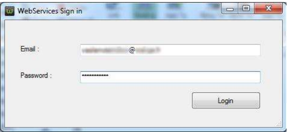
Validate by clicking the Login button. If you are already logged in, this box offers you to disconnect.
The Web Service component is visible in the middle of the page.
Warning: You must of course be connected to the Internet to edit a Web Service element!
In the properties, click the Create button and manage your items.
An external window WebCreator titled LMSOFT Web Services opens telling you that you have no element.

Click the Create your first HTML element button. An editing interface appears.
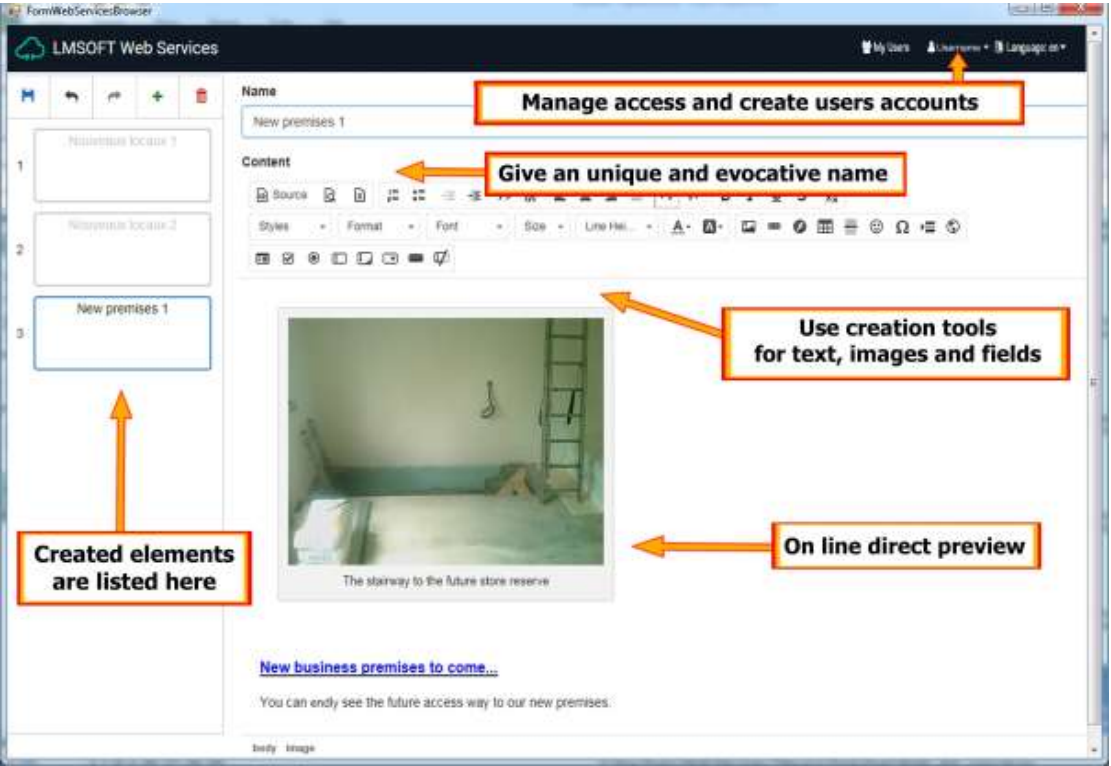
At the top left of the window, the 5 icons allow you to save the item , undo or redo an action, add a new item or delete one.
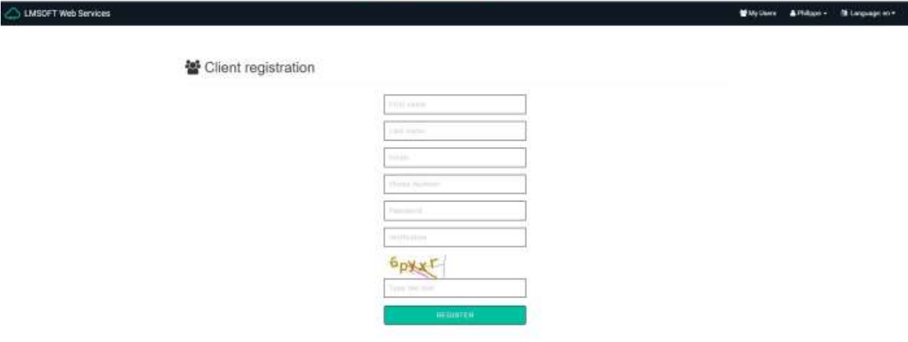
The My Users button is to create and manages authorized users to modify articles. Each article can have one or more authorized users.


Before leaving the editor, please do not forget to save the changes made with the icon in the top left.
Back in WebCreator in the Cloud element’s properties, select the item you want to display . If you have made changes to several elements, the button Reload cloud elements allows you to update the display.
Forms
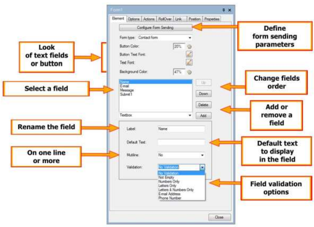
WebCreator has a new Form element located in the Data section of the Elements bar.
This element contains fields to be filled by the visitor of the site, which then sends them to a destination that YOU have predefined.
Sample forms are provided: Contact request , Booking, Order and Custom. In fact, you can add fields and additional elements customize.
